Hola :)
Olá, tudo bem?
Hello!
branding / packaging
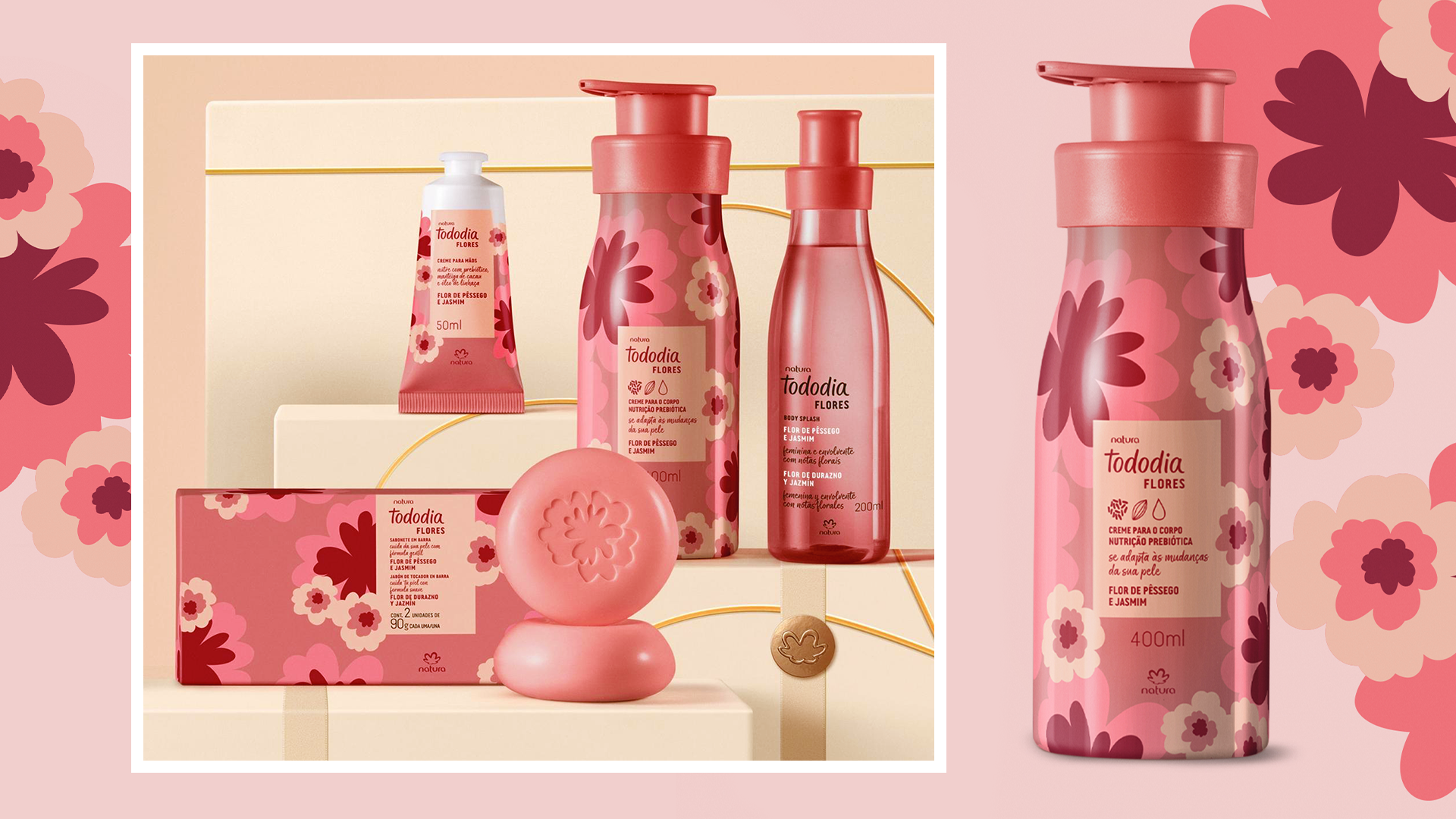
Tododia Flores
Identidade Visual / Packaging
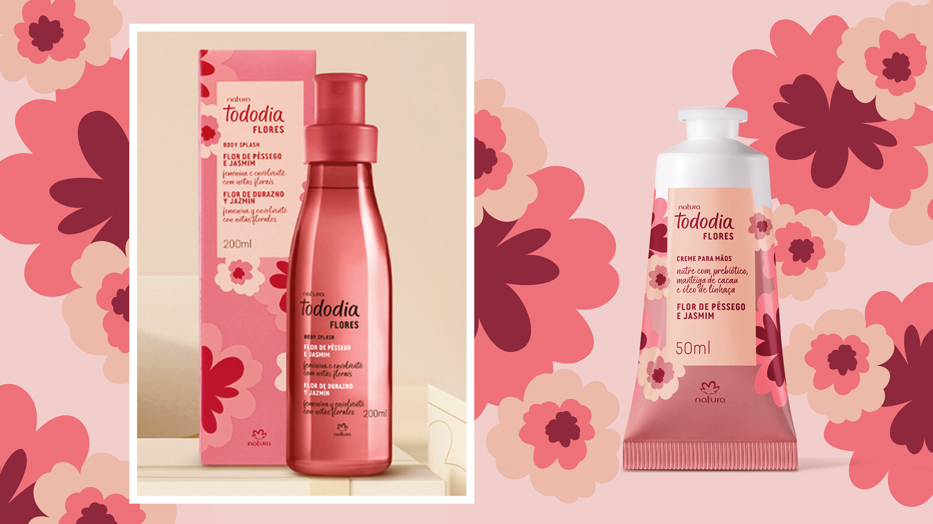
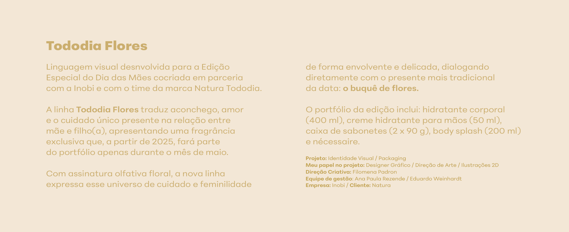
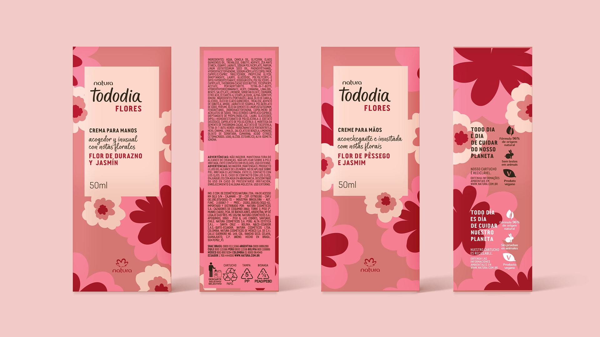
Freelancer. Rio de Janeiro, 2024. Fotos: divulgação natura.com.br
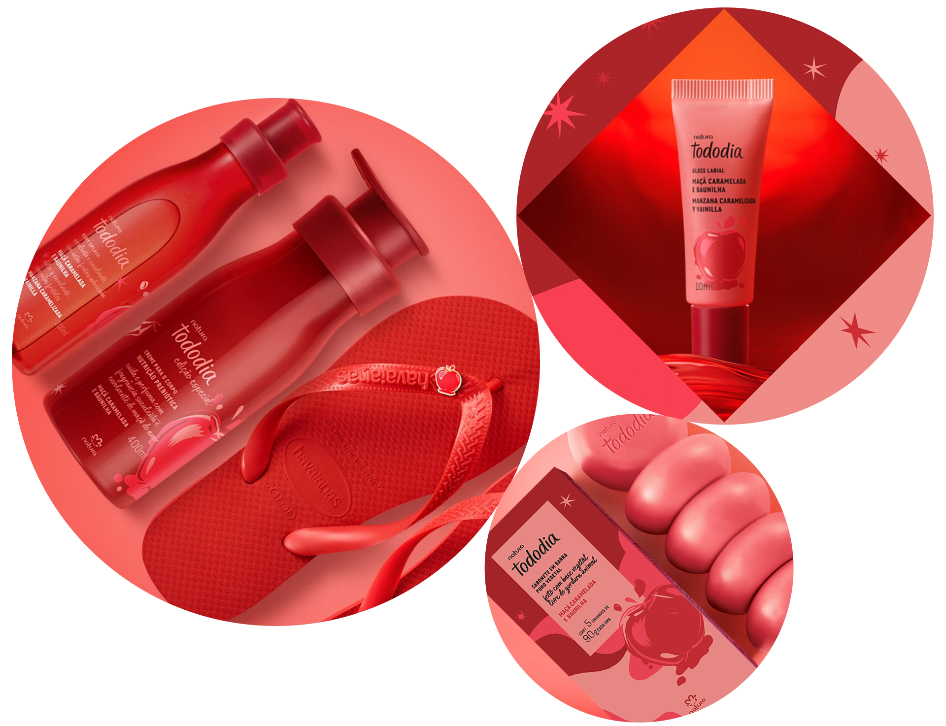
Kits Tododia
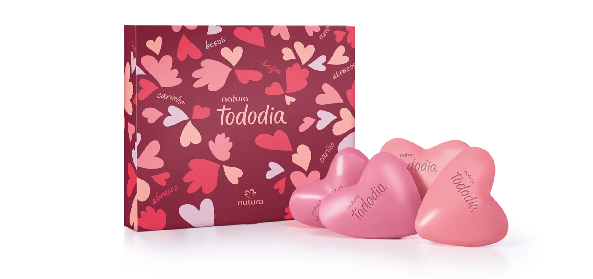
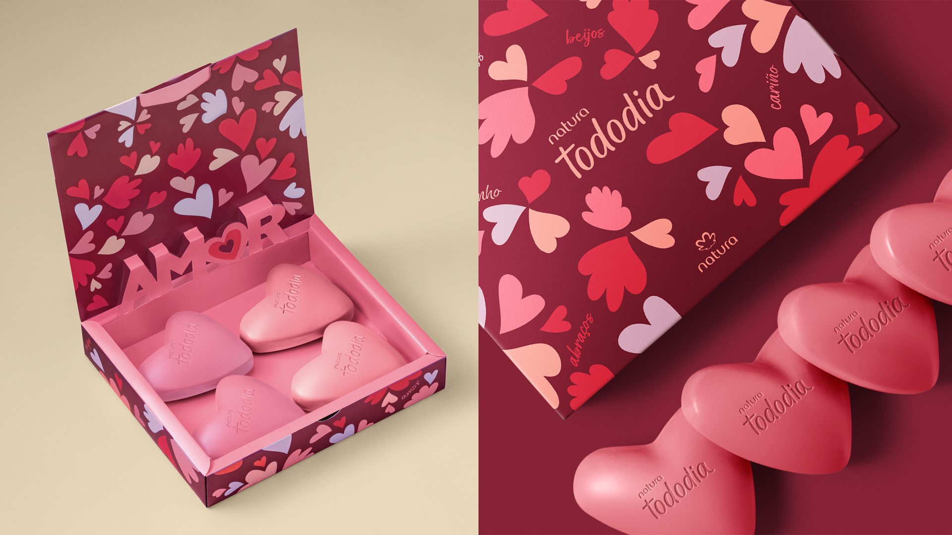
Freelancer. Rio de Janeiro, 2024. Fotos: divulgação natura.com.br
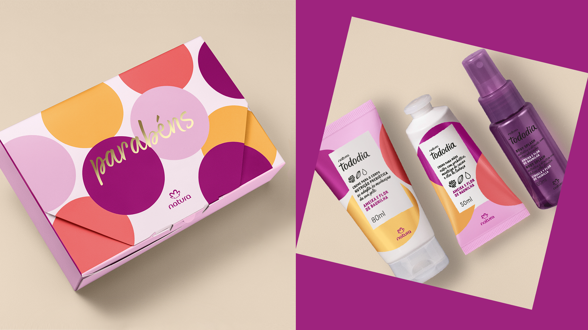
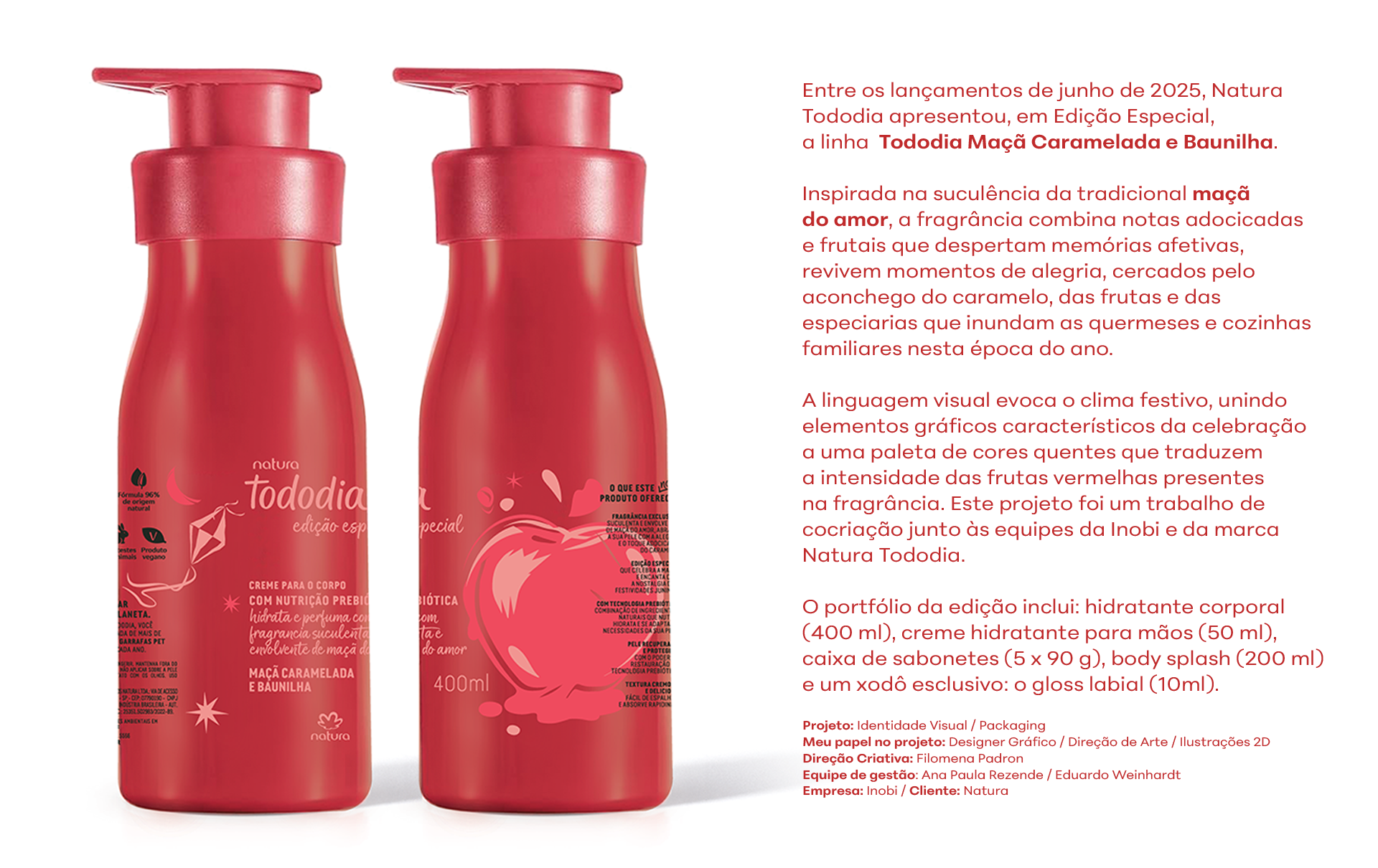
Tododia Maçã Caramelada
Identidade Visual / Packaging
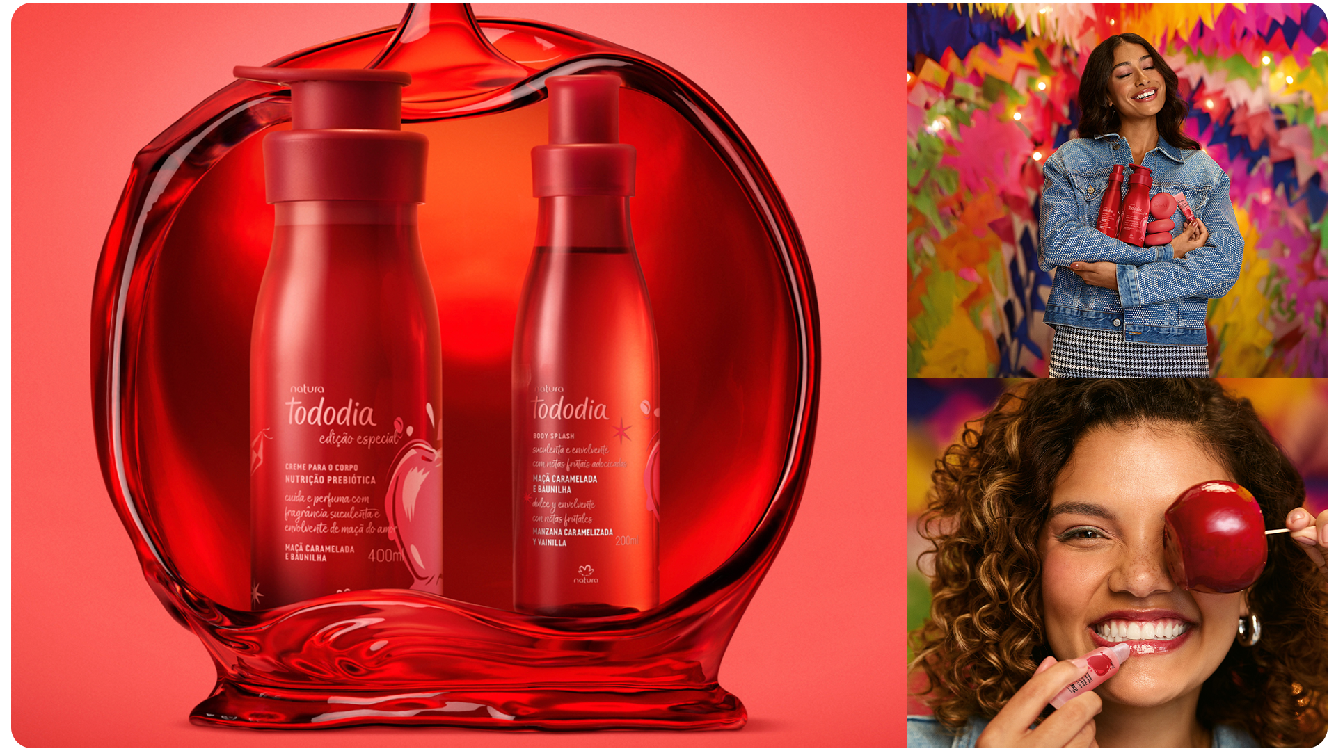
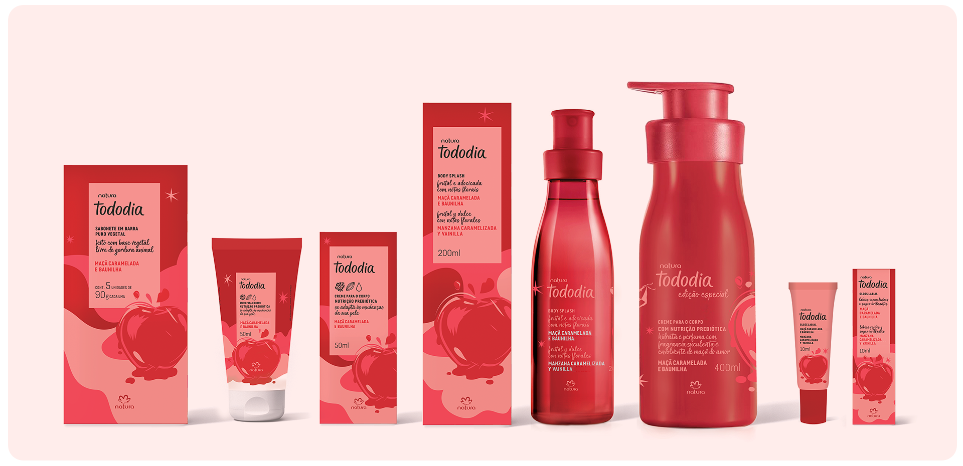
Freelancer. Rio de Janeiro, 2024. Fotos: divulgação natura.com.br

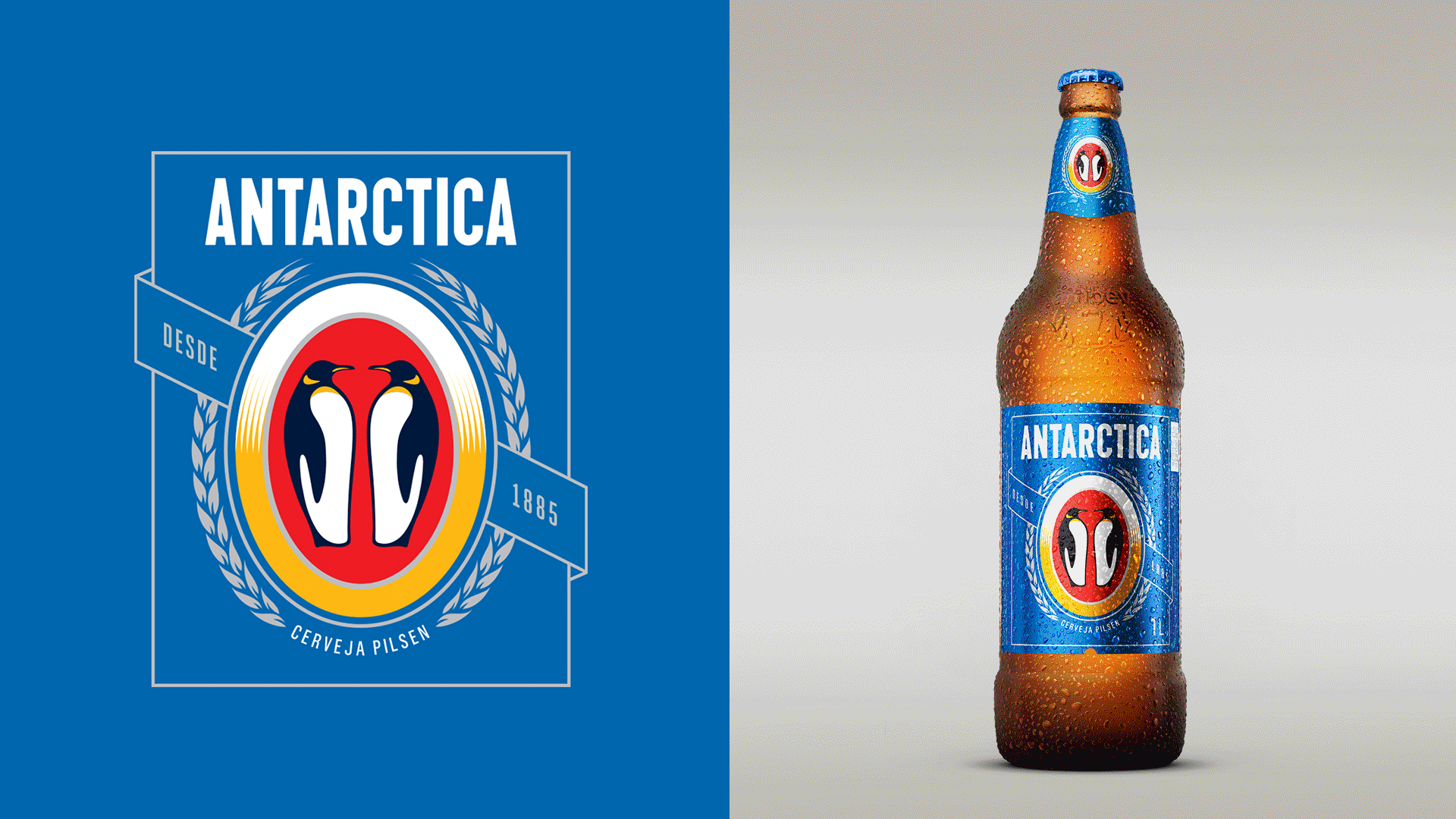
Cerveja Antarctica
Rebranding / Packaging

Rio de Janeiro, 2017
Empresa: Hardcuore / Cliente:Ambev
Empresa: Hardcuore / Cliente:Ambev

Opportunity
Rebranding / Identidade Visual


Rio de Janeiro, 2018
Empresa: Tátil Design / Cliente: Opportunity
Empresa: Tátil Design / Cliente: Opportunity

Do Bem™ Smooties
Branding / Packaging

Frutas & Sementes. Uma combinação perfeita, repleta de antioxidantes, vitaminas, fibras e proteínas. Para a nova linha Do Bem™ Smooties, desenvolvi a linguagem visual e ilustrações em 2D. Também participei da Direção de arte das peças de campanha junto ao time Hardcuore.

Branding / Packaging
Meu papel no projeto: Senior Designer / Direção de Arte / Ilustrações 2D
Direção Criativa: Breno Pineschi / Rafael Cazes
Rio de Janeiro, 2017
Empresa: Hardcuore / Cliente: Do Bem
Meu papel no projeto: Senior Designer / Direção de Arte / Ilustrações 2D
Direção Criativa: Breno Pineschi / Rafael Cazes
Rio de Janeiro, 2017
Empresa: Hardcuore / Cliente: Do Bem

Do Bem™ leite de coco
Branding / Packaging

Em janeiro de 2018, a Do Bem™ lançou seu primeiro leite vegetal à base de coco. Natural, sem lactose, sem glúten e super saudável. Uma versão original e três sabores: Baunilha, Café com Leite e Chocolate, porque o café da manhã não precisa ser sempre igual.

Branding / Packaging
Meu papel no projeto: Senior Designer
Direção Criativa: Breno Pineschi / Rafael Cazes
Rio de Janeiro, 2017
Empresa: Hardcuore / Cliente: Do Bem
Meu papel no projeto: Senior Designer
Direção Criativa: Breno Pineschi / Rafael Cazes
Rio de Janeiro, 2017
Empresa: Hardcuore / Cliente: Do Bem

Do Bem™ todo dia
Branding / Packaging


Depois de espremer muitas frutas, a Do Bem™ ampliou seu portfólio de produtos em 2017 e lançou a linha Do Bem™ Todo Dia oferecendo opções mais leves e novos sabores tropicais, sem adição de açúcares nem conservantes.
Branding / Packaging
Meu papel no projeto: Senior Designer
Direção Criativa: Breno Pineschi / Rafael Cazes
Rio de Janeiro, 2017
Empresa: Hardcuore / Cliente: Ambev
Meu papel no projeto: Senior Designer
Direção Criativa: Breno Pineschi / Rafael Cazes
Rio de Janeiro, 2017
Empresa: Hardcuore / Cliente: Ambev
Destilab™
Branding / Packaging

Destilados artesanais premium.
Lar do premiado Loki Dry Gin, medalha Duplo Ouro no New York World Spirits
Competition 2019.
Lar do premiado Loki Dry Gin, medalha Duplo Ouro no New York World Spirits
Competition 2019.
Branding / Packaging
Meu papel no projeto: Senior Designer
Ilustração: Rodrigo Borges @paralelozero
Freelancer. Rio de Janeiro, 2018
Cliente: Destilab
Meu papel no projeto: Senior Designer
Ilustração: Rodrigo Borges @paralelozero
Freelancer. Rio de Janeiro, 2018
Cliente: Destilab
Soma Creative Hub
Branding / Identidade Visual

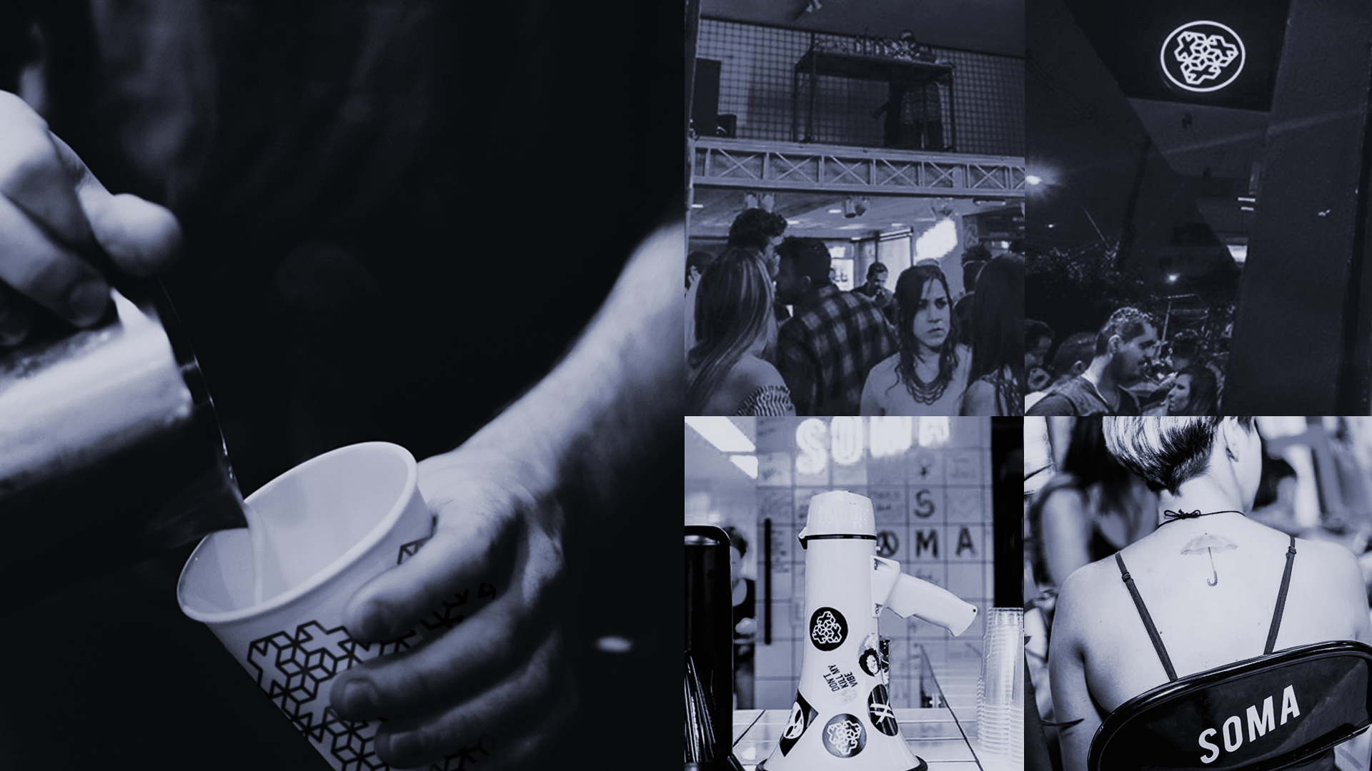
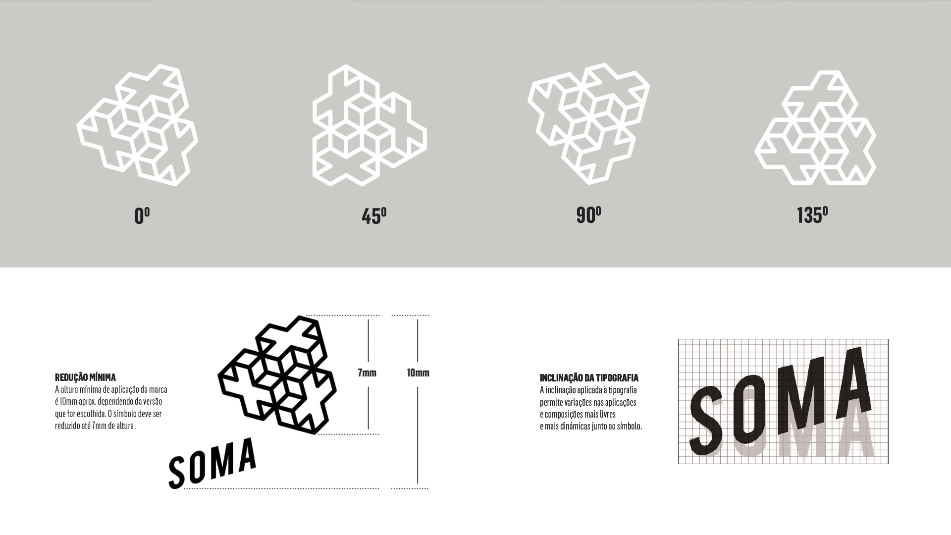


Espaço multiplataforma, localizado em Duque de Caxias, que promove encontros entre diferentes segmentos, como música, gastronomia, surf e moda.
Branding / Identidade Visual
Meu papel no projeto: Senior Designer
Direção Criativa: Breno Pineschi / Rafael Cazes
Rio de Janeiro, 2016
Empresa: Hardcuore / Cliente: Soma
Meu papel no projeto: Senior Designer
Direção Criativa: Breno Pineschi / Rafael Cazes
Rio de Janeiro, 2016
Empresa: Hardcuore / Cliente: Soma
Área Útil
Branding / Identidade Visual


Estúdio de arquitetura e urbanismo com sede em Salvador.
Branding / Identidade Visual
Meu papel no projeto: Concept/Designer
Freelancer. Salvador, 2013
Cliente: Área Útil
Meu papel no projeto: Concept/Designer
Freelancer. Salvador, 2013
Cliente: Área Útil